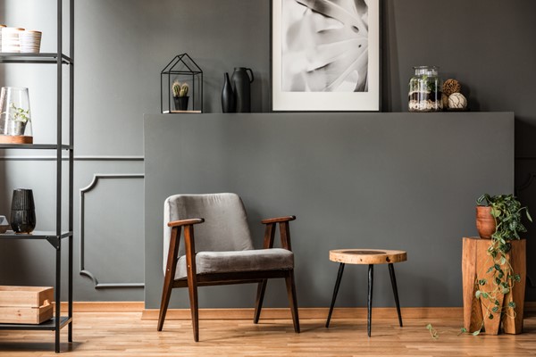
The commonly chic neutrals of the last couple of decades - namely mocha, bone, beige and café au lait - have given way to a more modern and sophisticated gray palette. While gray seems like a simple color, just a mix of black and white, in reality, there is a huge variety of gray tones, and you can use them to create different design vibes while sticking to the neutral color tones suggested by your real estate agent.
With over fifty shades of gray available from paint manufacturers, the choice can be overwhelming, even when sticking to just one color. The most crucial step in choosing your gray color palette is understanding how grays work together. While a gray begins with combining black and white, adding a variety of undertones gives it subtle shade variation. Just like when buying make-up, choosing the right cool or warm tones makes all the difference. Warm grays can look more brown, cool grays more blue or green and all of that changes depending on what color sits next to it. Most of you will be familiar with blue-grays, but you will also find golden-grays, green-grays, red-grays, and even purple- or brown-grays.
With So Many, How to Choose?
If you have the budget, find yourself a paint colorist. They have specific training and experience in modifying colors for an exact feel, and they understand how all those tones work together. However, that's usually out of budget for most. You can find all the same colors at your local home improvement or paint store but without that designer consultation. It saves you on the fees but requires more work to ensure you get just the right colors for your space. Its especially important that your gray remains neutral and doesn't clash with your existing art or furnishings, or it could do more harm than good.
When choosing your new paints, start by testing a variety of brands, finishes, and designers. Don't just stick with colors already available in your price range, since most of these stores will color match for free or a minor fee so you can get your custom color done by any brand. Try those different swatches out next to each other, your furniture, wall hangings, woodwork, brickwork and virtually any other color they might conflict with to determine which looks the best and creates the feel you want. Don't forget to test at multiple times of day and with both natural and artificial light, since that can change the color dramatically.
Once you've narrowed your paint choices down to three or four, get your store to mix sample size batches for you. Most stores will do a six to eight-ounce sample for a small fee or even free. While you're at the store, remember to pick up a roll of butcher paper and some painters tape. Using a separate sheet of butcher paper for each color, paint large swaths on the butcher paper and let it dry completely. Now, tape the giant color swatches to your walls. Test them on different walls and different types of day, just like you did with the small samples. Make sure you confirm how the paint looks under your lightbulbs. Keep in mind that LED and incandescent light bulbs will make the color appear differently. Since incandescent bulbs are being phased out, now is an excellent time to consider switching all our bulbs out for LEDs.
Most of all, be patient. Take the time to ensure you're choosing the right color, then take more time to ensure it goes on those walls correctly. Still not sure about what neutral works best for your home? Talk to your real estate professional for useful paint and staging tips.
About the Author
